Best Business Intelligence Tools
We’ve evaluated the top BI platforms to help you turn scattered data into clear, actionable dashboards. Whether you’re a finance team building executive reports or an analyst running ad-hoc analysis, we can help you find the right fit.
- Free version available
- Frequent updates
- High-impact, visual data summaries
- Drag and drop functionality
- Ease of access via mobile devices
- Integrations with many sources
After researching and comparing the leading BI platforms through our own independent review methodology, here are our top picks for business intelligence software. Whether you’re standardizing reporting across departments, building dashboards for executives, or putting analytics in front of non-technical teams, we can help you find a fit.
- Microsoft Power BI: Best Overall
- Tableau: Best Visualizations
- Domo: Best Transformation Tool
- SAP Analytics Cloud: Best for SAP Users
- Qlik Cloud Analytics: Best Reporting and Distribution
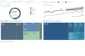
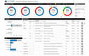
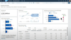
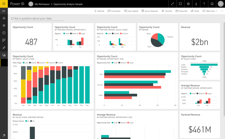
Microsoft Power BI - Best Overall
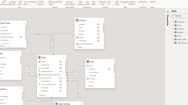
Microsoft Power BI is the most popular BI platform on the market, mainly due to its accessibility, low cost, and easy-to-use features. It covers the full BI workflow (data ingestion, modeling, visualization, sharing) in a single tool that the average business user can actually learn. Its semantic modeling layer is the core of why it works at scale: you can import data from over 70+ possible connectors, define relationships between tables, and write reusable measures in DAX that automatically apply across every report built on top of that model.
More recently, Power BI’s Copilot integration is what’s pulled non-analysts in. This lets you generate visualizations through natural language prompts. So you can just type something like “show me revenue by region for last quarter compared to forecast,” and it will display the data with a written summary of what’s changed. For users who never open the query editor, this makes Power BI feel more like a search box.
Power BI is also very affordable. There’s a free plan for personal use, but most businesses will need the Pro plan that starts at $14/user/month, billed annually. The catch here is that datasets cap at 1GB, so you may need to upgrade for heavier workloads. Also, while the basic reports are approachable, advanced modeling and DAX take real practice for new users.
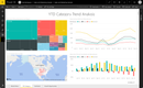
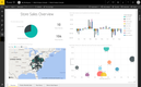
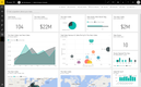
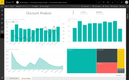
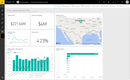
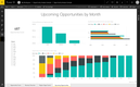
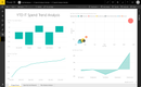
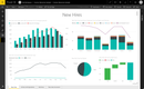
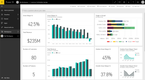
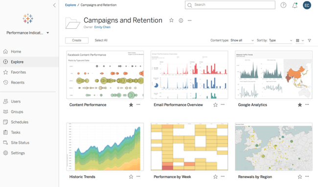
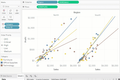
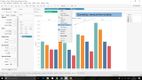
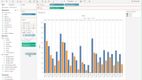
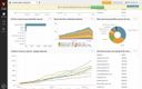
Tableau - Best Visualizations
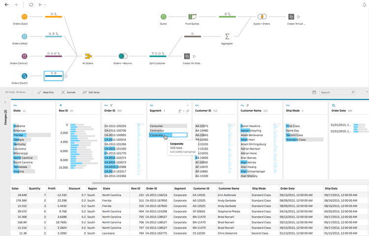
Tableau, (owned by Salesforce)’s VizQL engine, helps teams make unique and presentable visualizations from complex data. When an analyst drags a field onto rows, columns, or marks, the engine translates that into a database query and a visual specification simultaneously. This helps make exploratory analysis in Tableau feel different from building a basic chart in other tools. You can switch from a bar chart to a scatterplot to an MPA by dragging two fields without making a new query each time.
The depth shows up in what you can build:
- Level-of-detail (LOD) expressions let you mix granularities in a single view, like comparing each customer’s purchase to their cohort average without restructuring the data.
- Calculated fields and parameters support what-if analysis directly inside a dashboard, so a sales VP can change a commission rate slider and watch payouts recalculate live.
- Dual-axis and dual-encoding charts combine bar, line, shape, and color in ways most BI tools can’t render natively.
Like many BI tools, Tableau is leaning heavily into AI, particularly through its “Tableau Next” platform. This combines BI, AI, and workflow automation on an API-first, composable architecture. This basically means you can ask questions and see insights while you’re building visualizations. You can get this bundled with the core platform, though you’ll need a custom quote for exact costs. The Enterprise plan without the AI tools starts at $35/user/month.
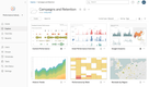
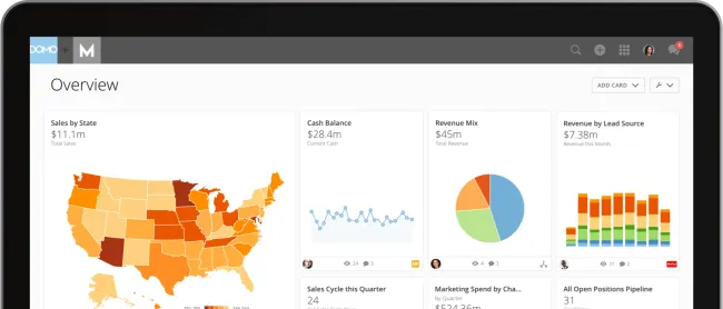
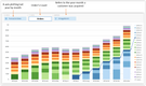
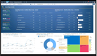
Domo - Best Transformation Tool
Domo’s Magic ETL is a drag-and-drop transformation tool that lets non-technical users blend data from 1,000+ pre-built connectors without writing SQL. So you can drop a Salesforce and a NetSuite dataset onto the canvas, combine them, and the output flows directly into Domo’s storage layer. This is great for mid-market companies that don’t have a dedicated data engineering team to get from raw data to analysis-ready visualizations.
The ETL tool is also effective for gaining predictive insights. You can use models to find trends and make more informed decisions based on forecasts. Domo has built-in tools for accurate modeling, like anomaly detection and forecasting. Plus, you can still use R or Python scripts for data analysis, or deploy external models without coding.
Domo is a single cloud platform rather than a desktop authoring tool with a publishing layer attached. This makes it more flexible for non-technical teams that want to generate visualizations faster. Domo doesn’t publish list pricing, and most users describe it landing well above Power BI once you factor in connector tiers and row-volume limits.

SAP Analytics Cloud - Best for SAP Users
SAP Analytics Cloud (SAC) is the default if you already use other SAP systems, like SAP Cloud ERP. It has a live connection to the Cloud ERP, which queries source systems in-memory without replicating data into a separate analytics store. So, for finance teams running consolidations or variance analysis against the SAP general ledger, dashboards reflect the same numbers as the underlying ERP in real time.
Another reason SAC stands out is that it bundles planning with BI. The same tool handles:
- Budgeting and forecasting workflows that write back into SAP, so a CFO who adjusts a regional revenue target doesn’t need to re-export the file into a separate FP&A system.
- Predictive forecasting and what-if scenario modeling, with built-in functions for time-series projection and driver-based planning.
- Financial consolidation features that handle intercompany eliminations and currency translation natively.
Despite being optimized for live connectivity with SAP products, SAC can still work with other ERPs. That said, they may require custom connectors, data-provisioning agents, or ETL, and the outputs typically take longer. SAC utilizes usage-based billing, so pricing depends on how much you use the system.

Qlik Cloud Analytics - Best Reporting and Distribution
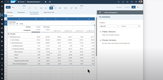
Qlik Cloud Analytics stands out for what happens after the dashboard is built. Of course, it’s proficient in creating insights and sorting data, but Qlik is great at producing polished files. The reporting module handles configuring reports, so you don’t have to do it outside the system. Just design a template in Excel or PowerPoint, bind it to the Qlik data model, and it generates branded reports on a schedule and even delivers emails if you need it to. Compare this with other systems like Power BI, where finance teams often end up exporting screenshots manually.
Additionally, Qlik also pairs well with the modern data stack. Its associative engine loads data into memory and indexes the relationships between every field. That way, you can click on any value to see what’s connected and what isn’t, rather than running a new query for every question. It even offers Qlik Automate for creating low-code workflows to help streamline your team’s day-to-day tasks.
Qlik has also added a ton of AI features to its offering, but take these with a grain of salt. The AI landscape is evolving each day, and while there are a lot of great use cases in BI specifically, there’s still a lot of hype and over-promising. It’s worth discussing with different vendors how AI works within the platforms and how you can use it to solve problems.
What Are BI Tools?
Business intelligence (BI) tools connect to your data sources, model relationships between them, and turn the results into dashboards, reports, and ad-hoc visualizations. The goal is to take data that’s scattered across systems (your CRM, ERP, WMS, spreadsheets) and put it in one place where business teams can actually use it.
A modern BI platform typically handles five layers: connecting to data sources, transforming raw data into analysis-ready tables, defining business metrics in a reusable model, building visualizations on top of that model, and distributing dashboards and alerts to the people who need them. Some tools cover all five well. Most are stronger in some layers than others, which is why BI tool selection depends as much on what you already have in your data stack as on the features in any one product.
How BI Tools Work
The BI workflow is consistent across vendors, even if every tool handles each step differently. Understanding the workflow helps you spot where a given tool is strong, where it’s weak, and where it’ll need to integrate with other systems.
- Data Collection: Tools connect to your source systems through native connectors, APIs, or direct database connections. Some software pull data into their own storage layer; others push queries directly to your cloud warehouse and only return results. The approach affects data freshness, query performance, and the cost of cloud compute.
- Data Transformation: This is where it cleans, combines, and reshapes raw data into something analysis-ready. Some platforms include built-in ETL tools (Domo’s Magic ETL, Power BI’s Power Query); others assume you’ve already handled this upstream in a tool like dbt.
- Semantic Layer: The translation layer between raw tables and the dashboards that business teams see. A semantic layer defines metrics like “monthly recurring revenue” or “active customers” once, in one place, so every dashboard pulls the same number. Without one, different teams calculate the same metric differently, and meetings turn into arguments over whose number is right.
- Visualization and Analysis: This is where you actually build the dashboards, charts, and reports. Self-service tools let you generate your own; more technical platforms (Looker, Holistics) require an analyst but produce more consistent output.
- Distribution and Action: Getting insights in front of decision-makers through scheduled reports, real-time alerts, embedded dashboards inside other applications, or mobile views. Some tools also trigger downstream actions, like pushing an updated metric to Salesforce or sending a Slack alert when a KPI crosses a threshold.
Different stakeholders care about different layers. Data engineers care about collection and transformation; IT leaders care about governance in the semantic layer; and executives care about distribution because that’s where insights actually inform decisions.
Key Features
The right BI tool depends on what your team already has and what they’re trying to do. The main capabilities include:
- Data Connectors: Native integrations with your cloud warehouse, business apps, and databases. Connector count matters less than connector depth: a tool with hundreds of shallow connectors isn’t necessarily better than one with fewer well-maintained ones that handle your actual source systems.
- Semantic Layer & Metric Governance: A central definition of business metrics that every dashboard pulls from. Without one, different teams calculate the same metric differently, and you’ll end up with conflicting numbers across reports within months.
- Self-Service Authoring: This includes drag-and-drop dashboard building, calculated fields, and filters that non-technical users can actually use. The bar isn’t whether the tool advertises self-service. It’s whether a sales ops manager can build a dashboard without filing a ticket.
- Data Visualization: Create different chart types, layout flexibility, interactivity, and dashboards that render on mobile. Visualization quality is the difference between a dashboard a CFO will present to a board and one that needs to be exported into PowerPoint first.
- AI Assistance: Natural language querying, AI-generated insights, anomaly detection, and automated narratives. Quality varies dramatically between vendors. Test it against your actual data before believing the demo.
- Embedded Analytics: Putting dashboards inside your own products or customer-facing applications. Different buying criteria entirely: API access, multi-tenancy, white-labeling, and per-end-user pricing models matter more than UI polish.
- Security and Governance: Row-level security (different users see different data), column-level security (sensitive fields hidden from unauthorized users), single sign-on, and audit logs. For regulated industries, also confirm SOC 2 compliance and data residency controls.
- Scheduled Reporting and Alerts: Distributing reports as PDF, Excel, or email, and triggering alerts when a metric crosses a threshold. Pixel-perfect formatted reporting matters for finance and compliance use cases; not every BI tool handles it well.
- Mobile Access: Native iOS and Android apps with dashboards built for a phone, not a desktop view scaled down. Field teams and executives on the road get more value from mobile-first design than from a responsive web view.
AI in Business Intelligence Software
Every BI vendor is shipping AI features right now. Some are practical and can actually be time savers. A lot of times, though, vendors are overselling their AI capabilities to feed into the hype. Knowing what AI in BI actually does (and where it still falls short) helps you separate the demo from what you’ll actually use. The common AI capabilities across BI tools fall into four buckets:
- Natural language querying (NLQ): Type a question in plain English (“what were sales by region last quarter?”) and get a chart back. For these, the quality varies wildly. Power BI Copilot, ThoughtSpot Spotter, Qlik Answers, and Tableau Pulse all do this, but the accuracy of the output depends on how cleanly your data is modeled. The more context it has and the more organized your data is, the faster and more accurate the charts and tables will be.
- Copilots and assisted authoring: AI that suggests visualizations, generates DAX formulas, or builds dashboard layouts from a prompt. Useful for analysts to speed up routine work, less useful for non-technical users who don’t know what to ask.
- Auto-insights and anomaly detection: The tool surfaces unusual patterns without being asked. Works well on clean, well-modeled data. On messy data, it generates noise.
- Generative narratives: Plain-language summaries of what changed in a dashboard. Useful for executive reports; risky if the underlying calculations are wrong, because a confident narrative makes errors harder to catch.
Pricing Guide
BI tool pricing varies based on user count, deployment model, and the size of the data you’re working with. Most vendors charge per user, but some shift to capacity or consumption-based pricing as you scale. Implementation, training, and cloud warehouse query costs are additional and can equal or exceed the licensing cost in year one. Here’s a general breakdown of what these cost annually:
| Tier | Company Size | Annual TCO | Examples |
|---|---|---|---|
| Low-Tier | 1-50 employees | $500-$5,000 | Zoho Analytics, Microsoft Power BI, ClicData |
| Mid-Tier | 50-200 employees | $5,000-$20,000 | Tableau, Qlik Sense, Domo |
| High-Tier | 200-500 employees | $20,000-$100,000 | IBM Cognos Analytics, SAP BusinessObjects, MicroStrategy |
| Enterprise | 500+ employees | $100,000+ | Oracle Analytics Cloud, SAS Business Intelligence, GoodData |