7 Bar Graph Alternatives and When to Use Them in BI Reporting
As technology advances and business management techniques continue to refine, there’s an increased focus on enabling data-based decision-making. It’s hard to find a company that doesn’t discuss how to turn analytics and business intelligence software into a competitive advantage.
The practical upshot is that reports or presentations with an unending stream of bar graphs are no longer effective.
For data visualizations to be effective, they need to:
- Engage the viewer,
- Clearly and quickly communicate data and
- Elicit appropriate responses from the target audience.
Selecting the right data visualization for each data set is the first and most important step to accomplishing each goal.
Pie Charts
Shifting from the rectangular bar to the circle pie chart is an easy way to bring visual variety to data presentations. A pie chart divides the circle chart into slices that illustrate numerical proportions, each representing a specific category’s contribution to the total. Because they are circular, pie charts offer an ideal vehicle for communicating the proportionality of items within a greater whole–which is a frequent need for the visualization of business data.
This is a good chart to use if you have a few categories to compare, as it easily shows the distribution of the total amount.
Line Charts
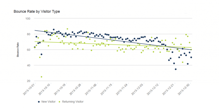
A line chart displays data as points connected by straight line segments. This graph is typically used to show trends in data over a period of time or to compare multiple data sets.
In a line chart, the x-axis typically represents time, whereas the y-axis is the measured variable.
Line graphs make excellent visualizations for time series, as time progresses at fixed intervals. This type of graph enables you to estimate values between data points and is good for visualizing continuous data. However, if there are numerous data sets, it can be difficult to read.

Scatter Plots
A scatter plot is a type of chart used to visualize a relationship between two numerical values. The chart displays data points on a two-dimensional graph, with one variable on the y-axis and the other on the x-axis. However, unlike in a line chart, scatter plots map data with single points that are unconnected by lines.
Line charts use lines between plotted points to illustrate trends within a specific data series. Therefore, while multiple data points in a single series on a line chart might share a position on the coordinate used for measurement (usually the y-coordinate), they can have one and only one data point on the coordinate used for categorization (usually the x-coordinate).
The advantage of scatter plots is that can plot multiple data points along the categorization/interval axis. Consequently, they are ideal for displaying data distributions where a single series of data might have multiple entries at the same x-coordinate (provided it is the x-coordinate that determines item categorization).
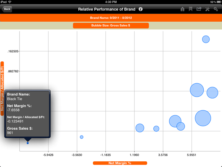
Bubble Charts
Bubble charts display information using ‘bubbles’ on a two-dimensional plot. Although similar to a scatter plot, a bubble chart extends the concept by adding a third dimension represented by the size of each bubble. This can help eliminate occlusion, which can happen with a scatter plot.
While the bubble chart can be used in this manner to overcome some instances where occlusion may occur, it might not prevent every possibility for occlusion. Multiple data series in bubble charts reintroduce the possibility for occluding data points. Large bubbles always run the risk of obscuring smaller ones. Theoretically, this problem can be solved by layering the datapoints from smaller to larger moving front to back, but not all software will make this option available or it may be too time-intensive to warrant the effort.
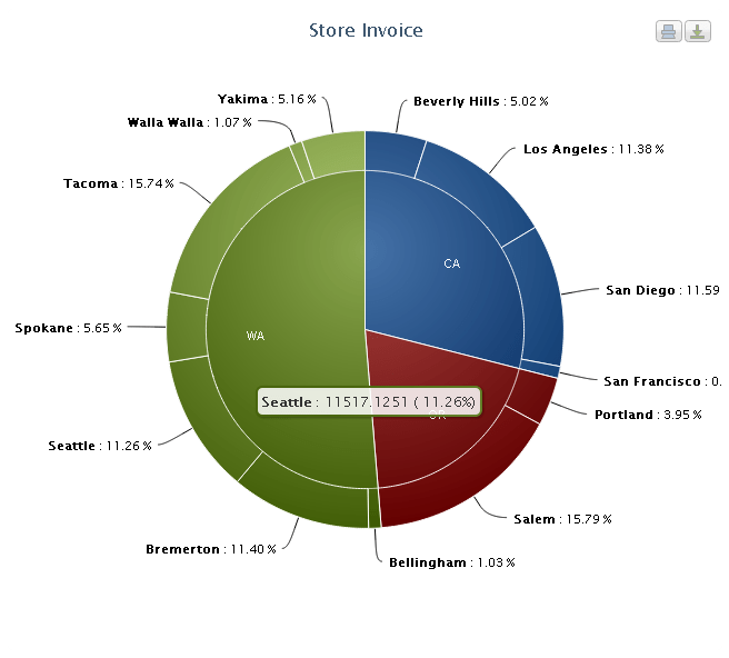
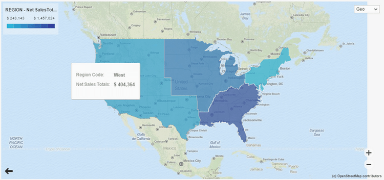
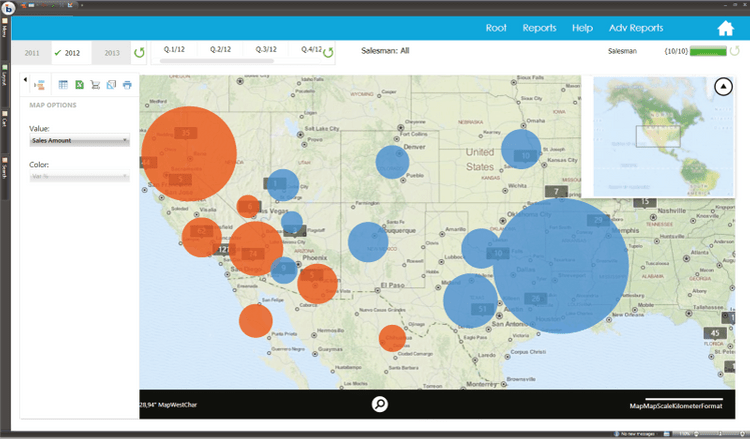
Map Charts
Map charts display data on geographical maps, using colors, patterns, or shading to represent the data values across different regions. This type of chart allows viewers to quickly grasp patterns and relationships.
The two most common types of map charts used in BI data visualizations are choropleths and proportional symbol maps. Which one is right for your use-case will depend primarily on whether you are looking to display data that maps to a territory or a specific point on the map. Map charts work particularly well in contexts that allow for interactivity, so that viewers can roll over locations on demand to reveal detailed quantitative data.
Choropleths are the map chart of choice when you need to differentiate measurements that correspond to territories on a map. Choropleths use colors, shading, or patterns overlaid on geographical units to display corresponding measurement data.
In cases where data points correspond to specific locations rather than wider territories, proportional symbol maps are the best choice. Much like a bubble chart, proportional symbol maps use the size of the icon (often a circle) marking the data point to demonstrate magnitude.
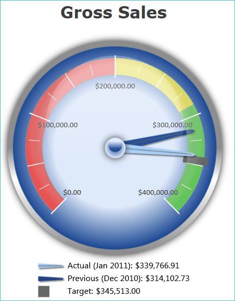
Meter Chart
A meter chart, also known as a gauge chart, displays a single valur within a predefined range, typically using a pointer on a circular or semi-circle scale.
Meters provide a laser focus, making them a frequent element on executive dashboards. Business leaders need to make rapid good/bad judgments based on real metrics, and meters provide a mechanism to help them do so.
The real business value of any visualization is not only to display information but to actually elicit a response. This is particularly true in the case of meters, which are often positioned in dashboard-type views. As a result, it’s important that meter design reinforces the qualitative judgment of the data presented within it. Gauges and other skeuomorphic displays which borrow from the vocabulary of real-world meters can be a good way to help viewers interpret the degree to which data corresponds to positive or negative performance.
Advanced Bar Graphs
While they are often overused, there’s nothing inherently “bad” about bar graphs. In many cases, they’re well-suited to the data. Being aware of the variety of bar graph variants, though, can help you choose the most appropriate bar graph option.
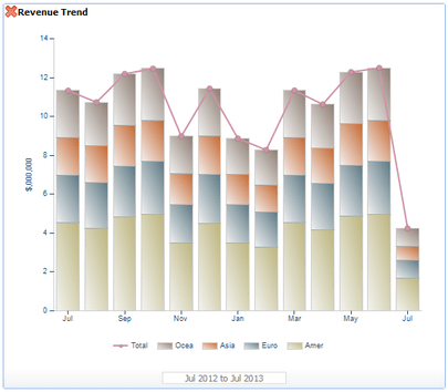
Bar graphs are great for comparing the magnitude between multiple categories of data. However, sometimes it is also important to display the value of individual items within the category. Stacked bar graphs provide a way to drill down to this level of detail. There’s one important caveat to be aware of when using stacked bar graphs: As both the number of categories and the number of individual items within categories increase, it will get progressively more difficult to interpret the stacked bar graph.
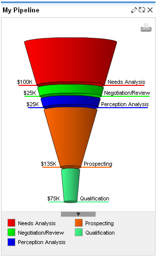
The quicker a viewer is able to interpret data, the better the data visualization. One trick that can be used to increase the speed of comprehension is using the shape of the bar itself to communicate information about the data contained within it. A bar graph modified into the shape of a sales funnel provides a good illustration of this approach. In some shaped bar graph displays each layer of the graph will lose proportionality in representing amounts, but labels can overcome this potential shortcoming.
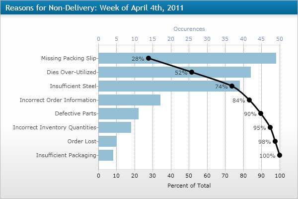
The Pareto chart is another example of how a modified bar graph can be used to display more information about the data. The foundation of a Pareto chart is a standard bar graph that displays the magnitude of data categories with bars. In a Pareto chart, data is presented sequentially by arranging the individual categories from largest to smallest. This arrangement allows for overlaying a line chart that calculates the percentage of the whole resulting from the sum of each category with all preceding categories. The Pareto chart is especially useful for prioritizing the most important categories or factors in terms of their contribution to the whole. It is commonly used with data sets that relate to improving quality management.