7 Best Tableau Alternatives and Competitors
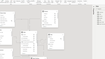
Tableau is one of the best business intelligence (BI) software and data science tools available for connecting data, creating visualizations, and sharing dashboards. Recently acquired by Salesforce, Tableau provides a variety of products (such as Tableau Desktop, Tableau Server, or Tableau Online)–meaning they should have an analytics platform fit to harness your data and give a complete view of your business.
However, Tableau isn’t for everyone. Depending on your situation, it may be too expensive to purchase, too complicated to use, or not practical for a smaller business. Whatever your reasons may be, we’ve compiled a list of the top Tableau alternatives available for your BI software needs.
Top Tableau Alternatives:
After being acquired by Salesforce in the summer of 2019, Tableau now has the backing of one of the top CRM software options on the market–enabling businesses to tap into their business data for deeper insights. Despite this acquisition, Tableau continues to face stiff competition as more self-service BI tools begin to emerge as just as great (if not better) options at a more affordable price.
If your business desires a data analytics platform that can help with data discovery, predictive analytics, or creating dashboards, look at our list of top tableau alternatives. Many options will have a learning curve, and we hope our list can help save you some time. These are by no means the only options available, but they are what we’ve deemed to be the best based on their selected category.

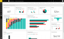
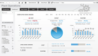
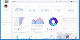
Power BI is a self-service business analytics tool developed by Microsoft. The BI tool can analyze and create visuals with your data, extract insights, and connect different departments across your organization. Power BI is visually appealing, has easy to use drag and drop functionality, and has features that allow you to copy formatting across your data visualizations.
Power BI is very easy to learn and understand. The intuitive user interface is based on Microsoft Office 365, making it user-friendly for employees who have experience with those programs. The business intelligence software also supports a variety of data sources. However, it can have limited access to SQL servers, Access DB, Oracle Database, IBM DB2, MySQL, and more (when compared to Tableau).
With regards to data visualization, Power BI offers drag and drop functionality, and most users agree data can be arranged in a visually appealing manner.
The professional version of Power BI starts at $10/month/user, making it one of the most affordable tools for your business. Existing users of Office 365 Enterprise E5 will be pleased to find a subscription to included in their Power BI Pro license.
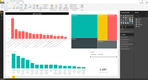
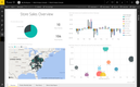
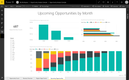
Many small businesses choose Qlikview to consolidate complex data, simplify their data visualizations, and get real-time access to their analytics. Doing so can help businesses improve their communications between departments (such as between a sales team and a manufacturing team) and streamline workflow (such as timing out orders more efficiently). In short, Qlikview can help turn your data into actionable insights.
Qlikview lets you import data from multiple sources and sort it however you want. A simple example would be creating basic bar charts, comparison charts, pie charts, and other share-to-total ratios. The associative experience with Qlikview provides recommendations on what data is the most relevant for analysis, which can save time during the data discovery process.
Qlikview is a very user-friendly software most known for its dashboard capabilities. The program is also very shareable–with access on mobile devices, users can share their reports and dashboards with other users for collaboration purposes or to simply share a recent data discovery.
Many businesses often confused Qlikview and Qlik Sense, which are two different products offered by Qlik. QlikView and Qlik Sense are based on the same technical core and use the same engine–but Qlikview is for guided analytics and Qlik Sense is for Self-Service Data Discovery.
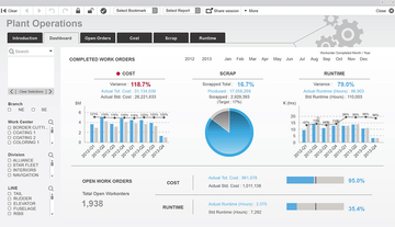
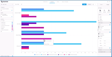
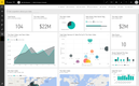
Sisense’s sleek user interface makes it easy to use for the masses–meaning an implementation into a large enterprise for dozens of users should go a bit smoother. The data analytics platform empowers analysts, engineers, and developers to transform their complex and at times confusing data into actionable steps your business can take. For larger businesses looking to make a real change (as opposed to a small business looking for simple budgeting and forecasting).
The program will let you compile data from almost any source. Examples of popular integrations include simple CSV files, Microsoft Dynamics products, Oracle, Salesforce, and more. This analytics information can be embedded into custom dashboards in the form of widgets, letting you create the types of views and presentation needed. Branded capabilities will let you create the perfect view for presentations outside of your organization.
Sisense has a number of templates available–letting you create the visualization you desire the most. The Sisense BIoX widget helps leverage your data with prebuilt templates and integrates applications that put functionality into your dashboards for an interactive experience. The framework exposes and accesses many API capabilities directly in the Sisense UI using standard basic CSS & JSON making access to these APIs accessible to a much wider range of developers in a low-code environment.
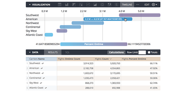
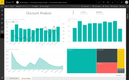
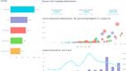
Looker is well-known for its visualization tools that turn your data into decisions that improve your business. The live, interactive dashboards give row-level detail so your team can drill into charts and gain a deeper understanding if the data. Being more informed about what your data means can improve email response time to customers due to shipping delays, trigger meetings with staff if specific quotas aren’t met, and more.
While relatively young in the business intelligence space, Looker (founded in 2011) has grown to over 1,500 customers globally with offices across the world. They offer major partnerships with Google, Amazon, Cloudera, Microsoft, and IBM.
Looker can be implemented in a variety of industries, but their biggest verticals are eCommerce, technology, media, gaming/eLearning, and finance. Whatever the industry, any business looking to take action with their data can benefit from Looker. An example of benefits provided by Looker includes a modern API focused modeling language, self-service reporting, app usage monitoring in real-time, and easy to use drill-down capabilities.
Looker is backed by their powerful visualizations through real-time dashboards that you can easily view and filter. Users can explore, create, and save their own reports. And sharing data is simply through exports, scheduled email reports, or Slack collaborations. Beyond dashboards, Looker helps your non-technical people to explore and ask any ad-hoc question of the data so they are not constrained to a specific dataset or are able to explore as they see fit.


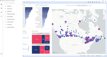
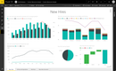
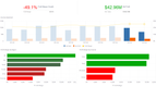
Spotfire lets you analyze any type of data found in your database or in your local computer. With a user-friendly interface, you can start from a selected set of data and have Spotfire recommend a visualization, you can select a visualization type and continue from there, or you can search to explore your data and create visualizations based on what you see.
Visualization types in Spotfire range from tables (such as cross and graphical), bar charts, waterfall charts, line charts, pie charts, and scatter plots. The deep data visualization and exploration offered in Tibco Spotfire is powered by interactive dashboards and point-and-click exploration–and even includes AI-powered recommendations, NLQ-driven search, or direct manipulation.
Data visualization features in Tibco Spotfire include data discovery, natural language search, analytical workflows for team collaboration, and access via mobile devices on iOS and Android devices. The combination of the AI search tool and natural language query can help you discover data relationships you didn’t realize you had, as well as other sentiments and recommendations that your business can get a deeper understanding of.

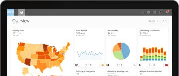
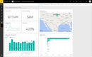
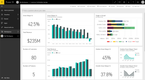
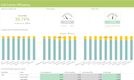
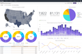
Domo is one of the most mobile-friendly BI tools on the market that can still provide stunning visuals when necessary. Upon logging in, the user-friendly interface lays out your options, such as connecting data, building a card, invite a colleague to collaborate, create a dashboard, set up alerts, and more. There is even a chat feature built into the program that can help you and your team better communicate about the data at hand.
The Domo Business Cloud lets you integrate data from thousands of sources. This data is turned into live visualizations and turns into workflows for your organization. Whether accessing from a web browser or the mobile app, your sales team, HR team, or finance team can be mobilized on the fly and have compete at cloud speed.
Automation can be set up to spend less time on back-end data integration or repetitive BI tasks. One example may be integration with your social media platforms. Your marketing team can quickly analyze content optimization strategies by analyzing the most recent top engaging tweets, top organic tweets, top paid tweets, most used hashtags, and more.
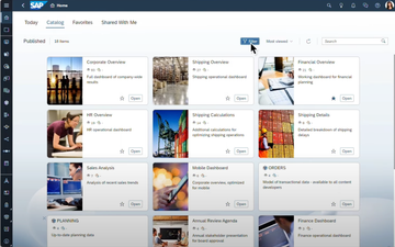
SAP Analytics Cloud can be custom designed around your business, with a focus in data exploration, data visualization and analysis, financial planning, and predictive forecasting. The business intelligence system is built on the SAP cloud platform for exceptional performance and scalability with a wide range of sources–most notably, SAP ERP software options.
Being able to connect directly to your SAP Business One or SAP ERP means all of your financial, sales, and operational data can be transfered into Analytics Cloud for further evaluation. In addition to direct ERP connections, SAP Analytics Cloud can sync with Microsoft SQL Server, CSV files, Google Drive, Salesforce, and Concur.
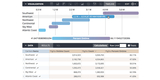
Creative features found within SAP Analytics Cloud include a “Search to Insight” tool which lets you input queries using natural langauge that creates easy to understand visualizations without having to sift through analytic content. You’ll also be able to keep tabs on your employees progress or work being done with a given data set through assigned tasks that you can monitor in a calendar view of Gantt chart.