Power BI Dashboards: 10 Examples and Best Practices
Microsoft Power BI offers built-in AI capabilities, real-time analytics, Excel integration, and intuitive visualizations. Jumpstart your dashboard design with these ten Power BI examples:
- Customer profitability
- Human resources
- IT spend
- Sales and marketing analysis
- Opportunity analysis
- Procurement analysis
- Retail analysis
- Supplier quality analysis
- Financials
- Corporate spend analysis
Power BI Dashboard Examples
Customer Profitability Dashboard
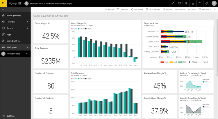
Created by a CFO for a marketing materials manufacturer, this dashboard portrays high-level factors that impact profitability. For example, the CFO can analyze their five business unit managers’ performance in addition to gross margins, customers, and products.
Key Metrics:
- Gross margin percentage
- Total revenue
- Number of customers
- Number of products
- Team scorecard with a gross margin percentage for each executive
Human Resources Dashboard
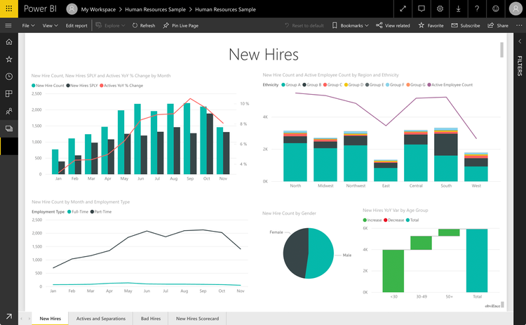
This dashboard helps an HR team monitor new, active, and former employees to understand who the company hires, potential biases in the hiring strategy, and any trends in voluntary separations.
Key Metrics:
- New hire count by gender, month, and employment type
- Active employee count by region and ethnicity
IT Spend Dashboard
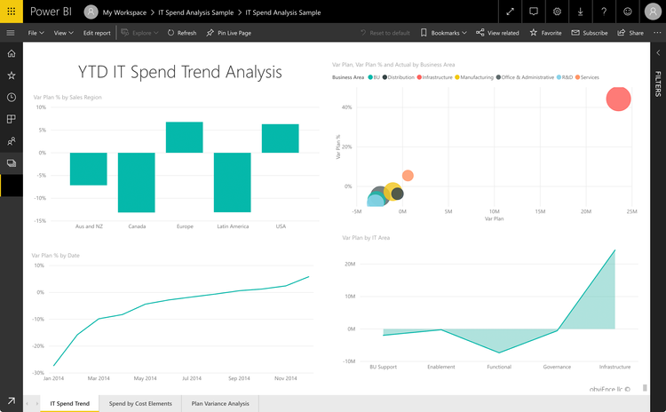
An IT Spend Trend analysis shows planned vs. actual IT costs to determine how well the business budgeted for the year. In this example, according to the Var Plan by IT Area graph, infrastructure was the most significant variance in planned costs.
Key Metrics:
- Variance plan percentage by sales region, date, and IT area
- Variance plan, variance plan percentage, and actual spend by business area
Sales and Marketing Analysis Dashboard
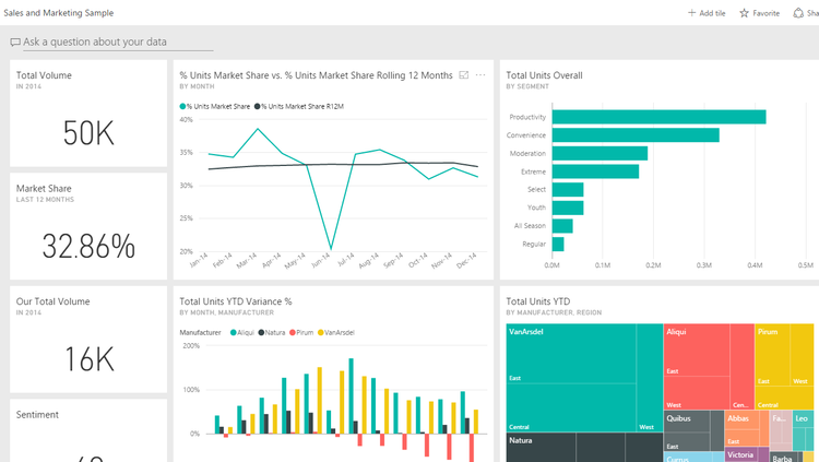
A CMO for a manufacturing company created this dashboard to track total product volume, market share, and sentiment. The CMO can also monitor competitors’ performance in the industry. A line chart measures the manufacturer’s market share fluctuations over 12 months.
Key Metrics:
- Total product volume for industry and company
- Total units overall
- Total units year-to-date by manufacturer and region
- Total units year-to-date variance percentage by month and manufacturer
- Market share percentage
- Sentiment
Opportunity Analysis Dashboard
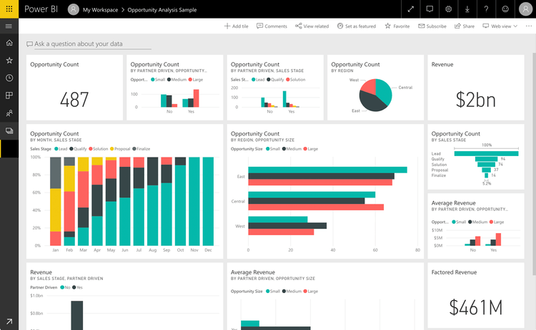
A software sales manager developed this dashboard to identify potential revenue growth opportunities through two sales channels: direct and partner deals. Opportunity count by region and size shows that the most potential is in the East region and that large partner deals tend to generate more revenue than direct sales.
Key Metrics:
- Revenue by sales stage and partner-driven deals
- Average revenue by partner-driven deals and opportunity size
- Factored revenue
- Opportunity count by partner-driven deals, opportunity size, sales stage, and region
Procurement Analysis Dashboard
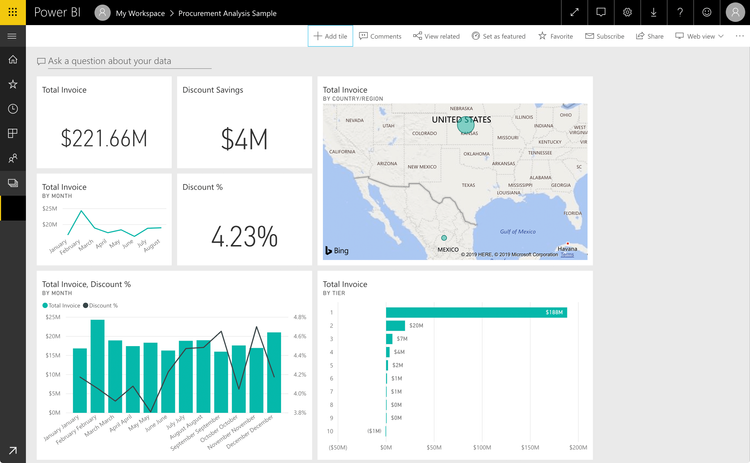
This dashboard allows a manufacturing plant to track vendor spending by category and location. Such metrics as total invoice, discount savings, and discount percentage help indicate the top vendors, which types incurred the most spending, and which vendors awarded the highest discounts to the business.
Key Metrics:
- Total invoice by country/region, tier, and month
- Discount savings
- Discount percentage
- Total invoice and discount percentage by month
Retail Analysis Dashboard
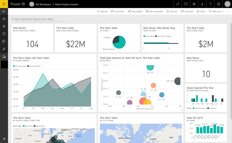
The metrics on this dashboard show a year-over-year comparison of sales, gross margin, units, and variance across multiple retail locations and stores. With this data, users can see the best and worst performers by district and identify potential causes for a drop or surge in sales compared to last year’s sales.
Key Metrics:
- Total stores
- This year’s sales by city/chain, postal code, store type, and new stores only
- Total sales variance percentage, sales per sq ft, this year’s sales by district
Supplier Quality Analysis Dashboard
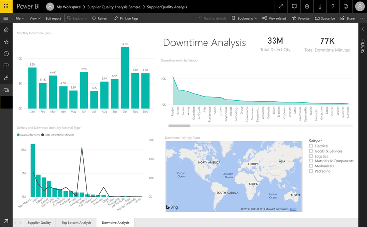
A supplier quality analysis monitors the total number of defects and downtime caused by defective equipment. These metrics enable a production company to identify the best and worst suppliers for equipment quality and the plants that efficiently minimize downtime by finding and rejecting faulty equipment.
Key Metrics:
- Total defect quantity
- Total downtime minutes
- Monthly downtime (min)
- Downtime by plant
- Defects and downtime (min) by material type
Financials Dashboard
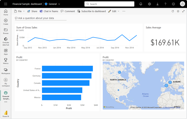
Sales managers, financial analysts, and executives use this dashboard to get a quick snapshot of sales trends and regional profit distribution. They can track sales trends over time to help identify high and low sales periods. They can also assess profitability by country to help guide their business strategy.
Key Metrics:
- Sum of gross sales (by date)
- Sales average
- Profit (by country) on bar chart
- Profit (by country) on geographical map
Corporate Spend Dashboard
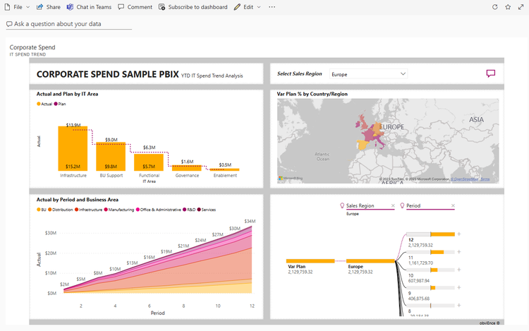
Finance executives, project managers, and IT directors can use this dashboard to gain insights into their company’s IT spending, helping with budget control and financial forecasting. It also helps them view regional variances in spending and historical spending trends.
Key Metrics:
- Actual and planned IT spend by infrastructure, BU support, etc.
- Variance in plan percentage by country/region
- IT spend over time broken down by business area (BU distribution, manufacturing, etc.)
- Regional IT spend comparison
9 Best Practices
To ensure your dashboard displays the data your end users need for optimal decision-making, follow these nine tips to provide them with greater self-service and insights.
1. Identify Predefined Business Practices
Examine the internal processes you want to measure and optimize. For example, if new visitor traffic to your e-commerce site lagged in the last quarter, focus on boosting new user traffic to your website.
2. Establish Resources
Determine the resources that power your business practices. For instance, attracting new web users requires labor from your marketing team, paid ads on various platforms, and a social media campaign about an upcoming sale.
3. Create Specific KPIs and Metrics
Monitor your progress by taking quantitative and qualitative measurements of your approach. For example, on your dashboard, include a metric for the percent change in new user traffic month over month. Also, measure the click-through rate of paid ads targeting new users.
4. Identify Your Audience
Center your dashboard design around the target audience that will access your data. For instance, if the audience is your stakeholders, present high-level information that shows the correlation of financial performance with new visitors streaming into your e-commerce site.
If your end user is the head of the marketing department, provide a drill-down option into traffic metrics so they can see how many new visitors entered your site through paid ads or social media.
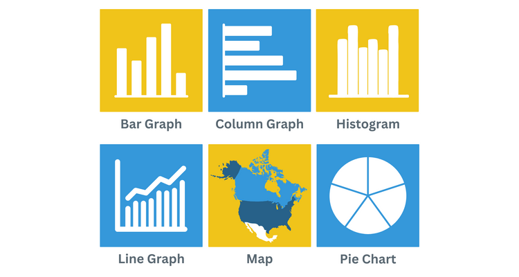
5. Build Simple, Scannable Graphs
Use white space and a limited color palette to keep your delivery clean and easy to read. An effective dashboard uses the right chart types to quickly and effectively communicate information. These charts may include the following:
- Bar graphs: For comparing large data sets (oriented horizontally)
- Column graphs: For comparing large data sets (oriented vertically)
- Histograms: For breaking numeric data into interval groups
- Line graphs: For tracking changes over a specific time frame
- Maps: For aggregating numeric values in specific geospatial areas
- Pie charts: For small data sets where you want to show percentages of a whole
Learn more about the 6 Design Examples in Business Intelligence.
6. Effectively Position Data
Think about how your audience skims content. Place your most important information in the upper half of the BI dashboard.
Most English speakers read from left to right, so place your content in the upper-left portion of their screens. Conversely, position your most actionable insights in the screen’s upper-right corner for users reading right to left.
7. Present Interactive, Real-Time Data
Business intelligence tools connect to many data sources to pull the most current information about your company. Add filters for time periods, traffic sources, locations, and more to ensure business users can manipulate different data types and observe relationships between values.
8. Describe and Explain the Data
Wherever possible, use descriptive labels to identify charts, KPI tiles, and other visualizations. For example, labeling a line graph with “New Users - Paid Ad Traffic, Last 30 Days” provides more context than simply “New Users.”
If you encounter any data deviations, insert a notation explaining the anomaly. When reviewing the dashboard, consider your users’ experience and anticipate the questions they might ask.
9. Provide Context
A good dashboard tells a story by providing KPIs and metrics to help end users draw conclusions and designate next steps. To help your team make the best data-driven decisions, go beyond simply reporting numbers.
For instance, you might show that your social media campaign drew 1,000 new users over the last 30 days. However, showing a percentage increase or decrease in that traffic month-over-month is more impactful, signaling the success or failure of new marketing efforts.
Go Beyond the BI Dashboard
Setting up your BI dashboard to provide compelling insights for critical decision-making is one key capability you need when choosing a BI tool. Other essential features include the tool’s ability to manage big data, provide KPIs, and integrate data. Explore these features and more in our Best BI Tools Guide.
Further Reading
Frequently Asked Questions
What should a BI dashboard contain?
BI dashboards should have the following three components:
- Scannable and interactive graphics, charts, and KPI tiles
- Interpretations of the underlying meaning of data
- A clear path forward in the decision-making process
What are the key benefits of BI dashboards?
The key benefits are:
- Accessible and shareable
- Built-in templates
- Data filters
- Drill-down functionality
- Ability to easily connect with data sources
- Interactive user interface
What are the limitations of BI dashboards?
The limitations are:
- Cluttered or overly detailed dashboards can overwhelm users.
- Users risk choosing information based on biased data.
- Extracting meaningful data depends on user proficiency.
- They often require self-service from an IT professional.
What is a PBIT file vs. a PBIX file?
A PBIT file is a Power BI template that retains your report structure but does not include any data from your source systems. PBIT files store queries, data models, visualizations, and other components to connect future data sources.
A PBIX file retains your actual data, queries, data models, visualizations, and other components.