6 Design Examples in Business Intelligence
To enhance performance, business intelligence (BI) tools convert complex data sets into clear insights for decision-makers. By focusing on six essential best practices, organizations can optimize their BI strategy:
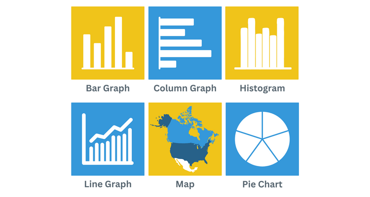
- BI Dashboards: Collect and present key business metrics on a single interface for quick access to critical information.
- Key Performance Indicators (KPIs): Use simple oversized text and progress meters that track progress toward goals, performance, and trends.
- Historical Trends: Utilize line graphs and stacked column charts to analyze past performance and identify patterns.
- Data Segmentation and Hierarchy: Use line, bar, pie, and area charts to visualize segmented data, helping users understand relationships and influences within the data.
- Variance and Benchmarking: Use progress meters, line charts, bar graphs, and data tables to compare actual performance against targets.
- Table graphics: Present tabular data with color coding and icons to enhance readability and draw attention to important figures.
6 Fundamental Visual BI Design Elements
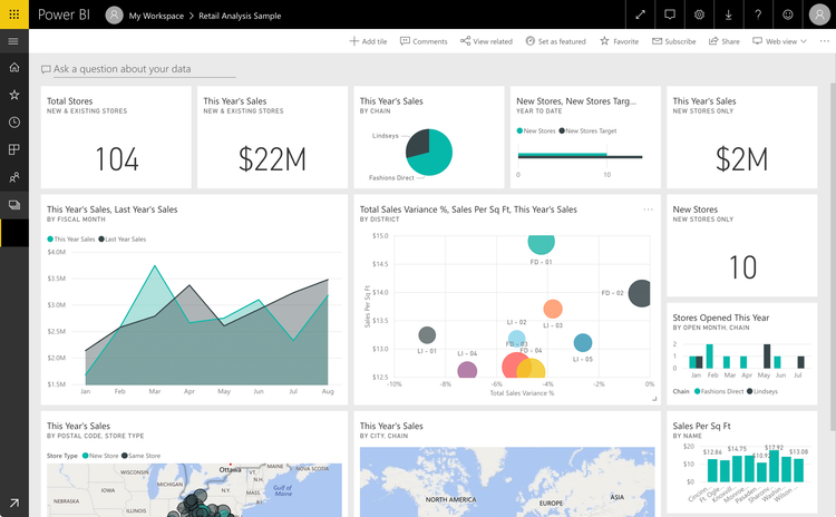
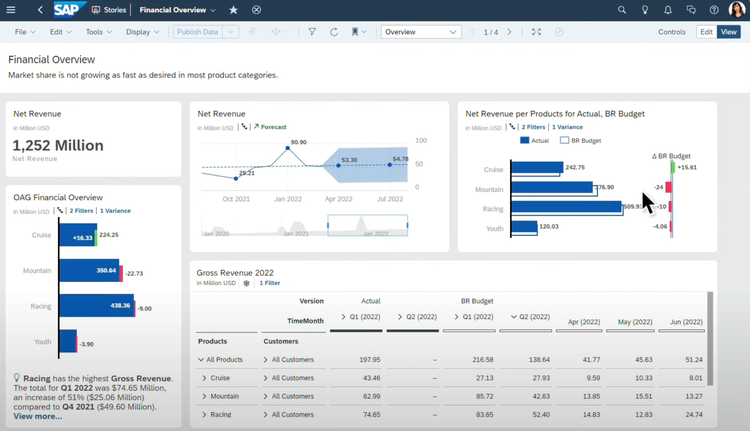
1 BI Dashboards
A BI dashboard presents key business metrics and performance indicators on one interface. Modern BI dashboards must balance the right amount of information while emphasizing the most important points. In general, they’re usually no larger than what can be viewed on a single monitor screen at a time.
Dashboards present the beginning rather than the endpoint for decision-making analysis. As a result, they must offer the ability to drill down into more granular views of aggregated top-line figures.
Effective BI solutions should be customizable to meet the unique needs of individual businesses and various functions within an enterprise. For example, if you work for a multinational company, you should be able to filter dashboard data by specific regions or stores.
Learn more in our article: What is Business Intelligence?
2 KPIs
While dashboards form the user interface for accessing business intelligence information, KPIs represent discrete data points. A KPI is a business metric that is particularly useful in reflecting the achievement of an important business outcome.
Since different employees prioritize different outcomes, the metrics displayed on the dashboard will vary based on each user’s role in the organization. For example, the average time to resolve collection issues is not a relevant KPI for a CEO with broader concerns, but it’s very important for an accounts receivable manager.
Not all business metrics are actually KPIs. For example, a revenue goal is not technically a KPI because it’s a target rather than a quantifiable measurement of achieved performance. So, context matters when it comes to discussing KPIs.
The two presentation styles most commonly used to display top KPIs are simple oversized text and progress meters. To ensure that top KPIs command the proper amount of attention in relation to their strategic importance, it’s important to be able to choose the correct KPI format and place them prominently on the dashboard.

3 Historical Trending
Analyzing historical trends gives us a deeper understanding of how changes in strategy, competition, and market conditions affect business results over time. Pinning quantifiable results to particular time windows is crucial for identifying what drives success.
The main challenge of historical data analysis from a design perspective is finding the right balance between showing individual data points and displaying overall trends.
Because of the dominant left-to-right model for consuming written information in English and most other modern languages, horizontal formats are usually the easiest way to present historical data. It’s also important to label axes, coordinates, and individual data points clearly.
Read our introduction to Power BI Dashboards 101 and learn from eight examples.
4 Segmentation & Hierarchy
Multidimensional analysis allows for deeper insights into the drivers of top-line results. BI dashboard users rely on the ability to segment data by dimensions such as customer, product/service type, location, department, manager, and sales channel to improve decision-making
However, adding more data points to gain a deeper understanding of contributing factors can complicate this process. Good design is key to managing the challenges and ensuring the accessibility of reliable conclusions from BI information.
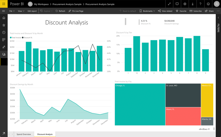
Standard approaches to displaying segmented data include line, bar, pie, and area charts. Because different chart types are better suited to different data sets, effective BI tools should offer a variety of visualization options.
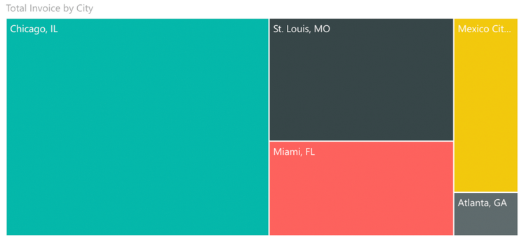
A common challenge in showing segmented data is managing hierarchy. As more levels are added, the difficulty increases. Treemaps and sunburst charts are effective at displaying multiple tiers of hierarchical relationships and the business results achieved at each level.
5 Variance and Benchmarking
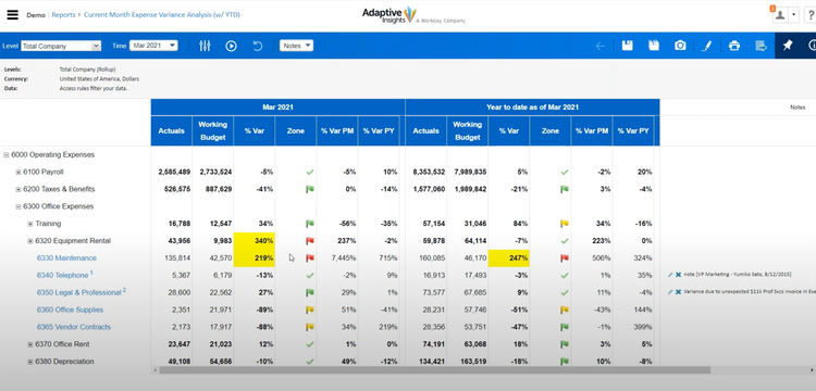
Once business goals have been set, you’ll need a mechanism for monitoring progress toward goal achievement. That’s where variance reporting comes in–it involves comparing actual performance against desired results.
Effective variance reporting compares desired results against actual performance over a time series. The risk with presenting multiple dimensions like these is that the data becomes too dense to easily interpret.
To manage this complexity, there are a few common data presentation formats frequently used in variance reporting.
For critical KPIs, simple visual tools like progress meters are often used. For more detailed analyses featuring multiple data series, line charts, bar or column graphs, and data tables are commonly utilized to make the information easier to understand.
Learn more about the 7 Bar Graph Alternatives and when to use them in BI reporting.
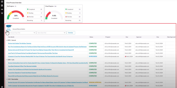
6 Table Graphics
A data table conveys a large amount of information in a small space. The potential problem with tables, though, is that the amount of data presented can become overwhelming. A trend in BI tools is to augment standard tables with visual embellishments to direct the viewer’s experience.
The addition of a symbol or a color is a great way to draw viewer interest to particularly important figures. Not only can colors and icons grab attention, but they can also reflect a quality judgment on the figure. Viewers intuitively understand that red represents negative outcomes, while green ones are positive, for instance.
Because table graphics provide a layer of predefined assessment and direction of attention, they can be especially useful in presentation reports, where it is useful to draw viewers to specific conclusions.
Different BI tools vary in how and when you can add color coding and icons to graphics. Some apps offer presentation-oriented editing modes with full customization, so you can tailor their appearance as needed.
Featured Products
Visualizations from the following BI products were featured in this article:
For more information on how to select the right BI program for your business, check out our business intelligence software guide.