The Best Dashboard Software
Dashboard software allows companies to consolidate data from different systems into easily digestible charts and graphs. We’ve ranked the top platforms for functionalities like built-in AI and analysis support.


- Drag and drop functionality
- Ease of access via mobile devices
- Integrations with many sources
Dashboard systems help companies in industries like financial services easily assess their data. Key features include KPI tracking, extensive integration capabilities, and generative AI.
- Tableau: Best Overall
- DashProphet: Best for Built-In Analysis
- Domo: Best for Financial Services
- Microsoft Power BI: Best Integrations
- Google Looker Studio: Best for Google and Marketing Dashboards
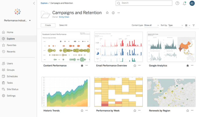
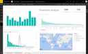
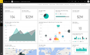
Tableau - Best Overall
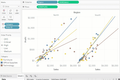
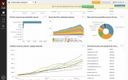
Tableau makes it easy for large companies to view high-level or granular data in one place. Within the dashboard creator, it offers Einstein generative AI that quickly answers your query and produces exact data. Simply ask a question about a trend or comparison, and it will generate a chart in seconds. It even develops a business context paragraph to make analysis faster. This helps reduce manual data searching and increase efficiency company-wide.
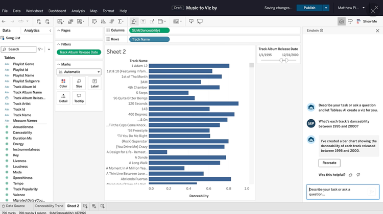
Tableau also integrates with almost any data source, including cloud-based and on-premise systems, databases, and spreadsheets through its API. While creating your dashboards, it consolidates all your data, which allows you to create personalized analysis workflows. Combine information from different systems with built-in grouping algorithms for better organization. This helps large companies using multiple systems to analyze high-level KPIs.
Because of its extensive features, Tableau does not offer a free plan like DashProphet or Microsoft Power BI. Its creator subscription starts at $75/user/month billed annually, with viewer licenses, used for sharing dashboards, starting at $15/user/month.
View our Tableau product profile for more info.
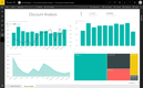
DashProphet - Best for Built-In Analysis
DashProphet offers on demand data experts to help you analyze your data and solve problems. This is great for non-technical business executives who require in-depth insights into company performance to make more informed decisions. While it’s not 24/7 support, the analysts are available during normal business hours.
Unlike many dashboard systems, DashProphet includes a built-in Data Lake, which is a central database for storage. This is opposed to other systems that rely on connectors, so the information is not accessible from the platform itself. It supports daily updates, so you’re always viewing fresh KPIs. This results in a more efficient system and simplifies the overall architecture.
DashProphet is a great option for midsize businesses with over $5M in annual revenue. While it offers a free plan for personal use, most companies will want to opt for the $500/month Team plan with unlimited users and dashboards.
See our DashProphet profile.
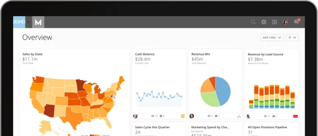
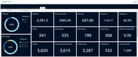
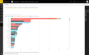
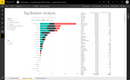
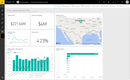
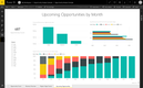
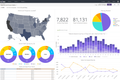
Domo - Best for Financial Services
Domo lets regional branch managers and organization executives alike view financial dashboards easily. You can create trend analysis graphs and charts using pre-built templates for industry-specific metrics, including:
- Loan management: Analyze loan default trends and measure funding needs.
- Customer profitability: Predict overall customer profitability across each branch and analyze interactions.
- Lead attribution: View lead generation success for previous periods across all channels.

Additionally, Domo helps financial service companies assess fraud risk. It combines data from every location, displaying a holistic view of information. Using machine learning and advanced analytics, the system generates automatic alerts for potential fraud. This is crucial for businesses like commercial banks, where risk is high and difficult to track nationally.

Learn more about Domo here.
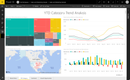
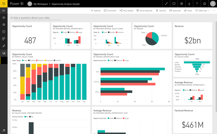
Microsoft Power BI - Best Integrations
Microsoft Power BI offers seamless integrations with the Microsoft ecosystem. It naturally connects with apps that most businesses use daily, like Excel, Teams, SharePoint, and Azure services. This allows you to embed interactive reports into any of these applications or pull existing Excel workbooks into dashboards in just a few clicks.
Along with integrations, the platform also boosts collaboration across your entire company. Finance teams can work together on Power BI reports within familiar Excel interfaces, and sales teams can view real-time dashboards on Teams calls. It’s a great tool to add on if you’re a mid to large company, so you don’t have to train every department on a totally new system. Power BI has a familiar interface and works within your established Microsoft workflow, so everyone can pick it up fast.
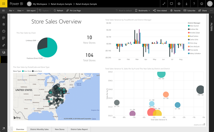
Microsoft Power BI offers a free plan for smaller companies, though you can’t export or collaborate on any of the dashboards you create. For most businesses, the Pro plan is more appropriate, starting at $14/user/month, billed annually. That said, if you’re an enterprise company, you may need advanced features found in more comprehensive systems like Tableau.
Check out our full Microsoft Power BI product profile for more info.
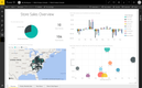
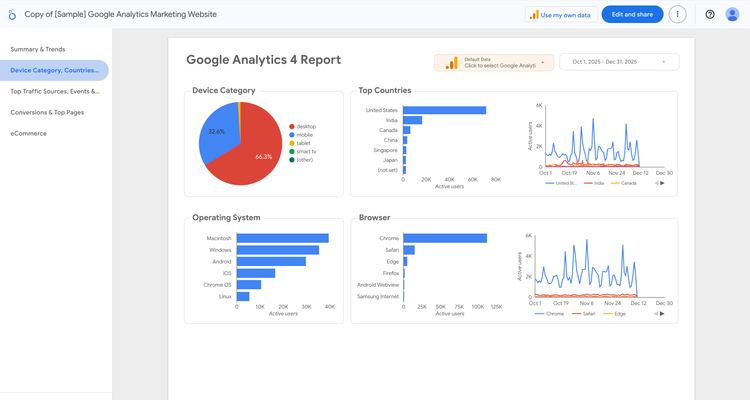
Google Looker Studio - Best for Google and Marketing Dashboards
Google Looker Studio is an easy-to-use dashboard tool for teams that heavily rely on the Google ecosystem. Its native integrations with Google Analytics, Google Ads, Search Console, and BigQuery make it a fit for marketing teams that want fast, reliable visibility into campaign performance.
The platform features a simple drag-and-drop builder and over 30 visualization types, enabling users to create dashboards without prior technical experience. Prebuilt templates for common ad campaigns and SEO reports help marketing teams get up and running quickly. For example, you can build a website performance dashboard that pulls in data from Google Analytics to view top landing pages, user engagement, and traffic trends without writing any code or configuring complex data pipelines.
Looker Studio also supports hundreds of third-party connectors for channels like Facebook(Meta) Ads, LinkedIn, Shopify, and HubSpot. This enables teams to manage cross-channel marketing in a single system, eliminating the need to switch between platforms. Users can blend data across sources, apply custom calculations like ROAS or CPA, and adjust filters or custom dimensions to tailor dashboards for different stakeholders. For agencies handling multi-platform reporting, the flexibility and ease of use are one of its strengths.
Looker Studio is free to use, with an optional upgrade to Looker Studio Pro for team workspaces and advanced sharing controls. The platform is more lightweight than other enterprise BI tools, such as Power BI, making it best suited for marketers, agencies, and Google-centric organizations that require straightforward dashboards rather than in-depth data modeling. For that, Google positions its enterprise Looker BI platform for that level of complexity.
What is Dashboard Software?
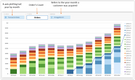
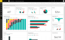
Dashboard software is a type of business intelligence software that creates visual representations of key performance indicators (KPIs), from multiple data sources. These business metrics are intended to help monitor current operations (business performance), provide tactical ways to achieve business goals, and analyze situations, employees, departments, and more to determine how to improve the health of your organization.
A dashboard has its name derived from the dashboard of a car vehicle, which shows an array of real-time data about the car’s performance (such as a speedometer, odometer, and fuel gauge). In terms of business intelligence, a dashboard shows a company’s current and historical performance. A BI dashboard will show whatever KPIs are desired to identify trends, evaluate potential issues, and reduce costs.
Key Features
| Feature | Description |
|---|---|
| Key performance indicators (KPIs) | Anything that evaluates the success of an organization, activity, or employee. KPIs measure value and demonstrate how to achieve business objectives by reflecting on the achievement of an important business outcome. |
| Data discovery | The process of collecting data from databases and consolidating it into a single data source or data set that can be instantly evaluated. |
| Drag-and-drop capabilities | Edit and customize dashboards with flexible chart widgets and an arrangement you created. Simply click on a chart or widget and drag it where it needs to be on the page. Change the size of any graphs or patterns by re-sizing them, and fit more data onto your dashboard. |
| Data visualizations | Patterns, trends, and correlations that place data sets into a visual context to help people understand. |
Common Types
There are three primary types of dashboard software: Operational, Strategic, and Analytical.
Other types of dashboards found in software, such as customizable or interactive dashboards describe more of a feature capability of the dashboard, rather than then capturing the intent of the dashboard.
Operational Dashboard Software
Operational dashboard software shows performance data in real-time through traditional visuals such as charts and graphs. Operational dashboards are intended to be easy to understand and digest. They are mostly used to provide an overview of operational processes in the business and are meant to be viewed continuously throughout the day. Because of this, the information on them is constantly changing and providing updated details. Operational dashboard software helps you view “at a glance” rather than providing drill-down capabilities (however, this can be a capability if needed). They are best used to give alerts based on real-time data.
Operational dashboards are the classic dashboards most people think about when it comes to what you’d find in a quality business intelligence software or reporting tool. They are usually displayed in operational settings, such as a manufacturing plant floor showing production output, or a call center showing the number of sales closed that day.
Strategic Dashboard Software
A strategic dashboard software is a reporting tool that is designed to monitor and track performance in relation to key performance indicators (KPIs). This is best used when monitoring long term strategies that can provide an enterprise-wide impact to the business. An example would be aligning the performance of separate departments to see if they are meeting the standards of your laid out corporate strategy.
While this information can be useful for the departments involved, strategic dashboards are generally used in “high-level” scenarios where you need a top-down view of a situation. Because of this, they can also be called “executive dashboards”, as their primary business users would be executives or senior-level employees.
Data in strategic dashboard software is meant to be viewed infrequently, and thus data is updated on a recurring (but irregular) basis.
Analytical Dashboard Software
Analytical dashboard software contains a large amount of data analytics that help analysts identify trends to make informed decisions about the future. Analytical dashboards rely on historical data usage so that trends can be identified and compared with variables in order to create predictions, set goals, and eventually implement new business strategies.
Analytical dashboard software functionality is prevalent in most BI tools, as they provide the most value to a data analyst. The need for real-time data is lessened, as trends and insights discovered are based on historical data. Business users will look to find options that have drill-down capabilities and ad-hoc querying due to the sheer volume of data they may be sifting through.
Interactive Dashboard Software
Interactive dashboard software provides exactly what it sounds like; dashboards that can be interacted with. The examples shown above show a still image of data, but anyone who has access to those dashboards directly in the dashboard software may have the ability to drill down deeper into the key metrics (providing that dashboard is interactive).
In short, interactive dashboard software will let you filter your view to whatever you want to get more insight on a specific area or dip deeper on a potential trend.
Custom Dashboards
Custom dashboard software provides any dashboard that is created outside of a generic template. Customized dashboards show the data that you want and are laid out in the manner that you desire. They are typically self-service and let the user have full control over what the intended audience can see.
If you’ve ever created a new spreadsheet in Google Sheets or Excel, you know that you have the option of choosing a blank template or a generated template to start filling in your information. On the one hand, the pre-packaged template that helps dig into your monthly leads-generated report looks ok, but you wish you could tweak it slightly to emphasize sales captured from different data sources. The ability to customize your dashboard to share exactly the data you want (and eliminate unneeded info) is the core of any custom dashboard functionality and should be a part of most dashboard software tools.

Free Options
Some of the most widely used free dashboard software options include:
1 Microsoft Power BI
Microsoft Power BI is the most widely used dashboard software on the market, and it also offers a free version. It lets you connect up to 10GB of data from a wide range of sources, and create dashboards and visualizations. That said, you’ll need to pay a subscription fee to share the charts or collaborate with others.
2 Metabase
Metabase is a free open-source dashboard and BI tool for developers and small teams. The system offers a free version that allows you to deploy the core BI experience on your own servers. With this version, you receive unlimited queries, charts, and basic dashboards. The paid plans remove the “Powered by Metabase” watermark for embedded dashboards and add Metabot AI capabilities.
3 InetSoft
InetSoft has a free visualization dashboard software that is a reduced version of their paid option, Style Scope. The software is cloud-based and offers a drag-and-drop designer to create some executive monitoring dashboards or interactive operational dashboards. InetSoft also provides free training via an online documentation library and videos. The software is intended for individuals and is not recommended for commercial businesses.