The Best Data Visualization Tools
Get the best software for your business. Compare product reviews, pricing below.

What Are Data Visualization Tools?
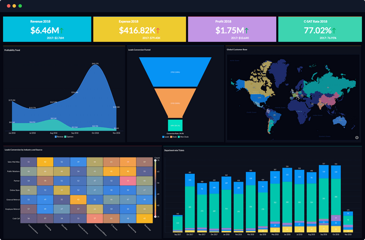
Data visualization tools create a visual means of enabling rapid consumption of key business data. The visualizations of big data will come in many forms, primarily charts, graphs, and plots. Data visualizations are just one of many types of BI tools available that engage the viewer, communicate the data, and elicit the appropriate response from the target audience. The data can come from a variety of sources, such as a spreadsheet in Excel or your accounting or ERP software.
Data visualization tools can be used by entrepreneurs and freelancers looking for analytics on their work, or by large enterprises looking to justify important business decisions.
Data visualizations provide the business intelligence needed to help interpret and present your data. Selecting the right data visualization tool for your data sets will help you accomplish your business goals.
What Visualizations Can You Create in Data Visualization Software?
There are seven major types of visualizations that can best exemplify big data:
- Bar graphs
- Pie charts
- Line charts
- Scatter plots
- Bubble charts
- Map charts
- Meters
Which types of data visualizations will work best for your situation? Usually, your visualizations take two (or more) pieces of data and combine them to show a relationship, a distribution, or a composition. You’ll want to think about what your business is trying to share to pick the best data visualization software.
A relationship is a situation that exists between two pieces of data when one table has a foreign key that references the primary key of the other table. The distribution of a statistical data set is a listing or function showing all the possible values of the data and how often they occur. Composition means that the components are combined to form a compound.
Relationships
- Deviation can help emphasize variations from a fixed reference point. These include diverging bars or spine charts.
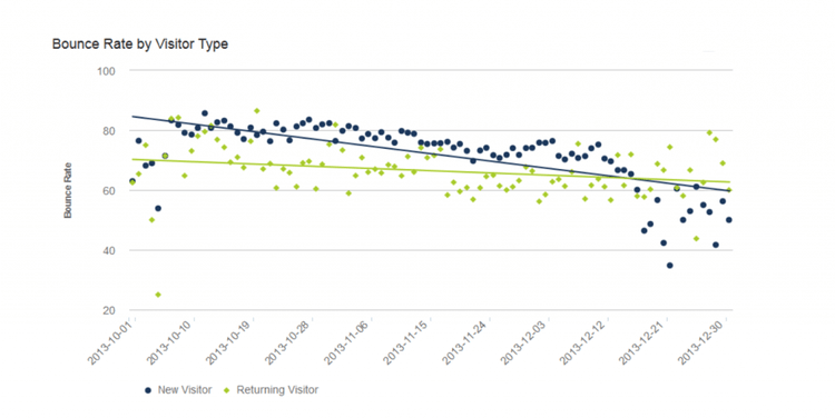
- Correlation shows the relationships between variables. These include scatterplots and combined line and column charts.
- Ranking shows items in an ordered list based on their importance or value. This includes ordered bars or columns or a dot strip plot.
Distribution
- Distribution can show how often values occur in a dataset. This includes histograms and boxplots.
- Changes over time show movements over time-periods. This includes line graphs and columns.
- Part-to-whole can help break a single entity into different elements that are intended to be highlighted. This includes stacked columns, pie charts, Venn diagrams, and treemaps.

Composition
- Magnitude shows size comparisons and can be both relative or absolute. This includes stacked bars or paired bars.
- Spatial is used whenever locations or geographical patterns are being visualized. These include Choropleths and contour maps.
- Flow is used to show movement between different states which can help trace the outcome of a process.
But how do you best engage the viewer, communicate your data, and elicit the appropriate response? Choosing the best data relationship will be one of the most important parts of telling your story.
Questions To Ask
To determine if your data is best explained via a relationship, a distribution, or a composition, you’ll want to ask the following questions:
- What story do you want to tell?
- Who is your audience?
- Are you trying to analyze a trend, showcase data, or compare two sets of data?
- Is any of your data time-based or time-sensitive?
- How does your data exemplify key performance indicators?
Is Excel a Data Visualization Tool?
Excel is great for people performing data analysis but may miss the mark on providing data visualizations worth your time. Excel provides sufficient tooling to help you determine what type of charts or logic will work best when creating your data story. In fact, Excel (or any basic spreadsheet tool, such as Google Sheets) encourages their users to insert charts, pivot tables, or a power map for interactive graphing. With enough knowledge of how to work the program, the tool can create the needed visuals that may work well for your company.
However, creating these visuals en masse will prove to be a headache, and any company looking to consistently create visualizations from their big data would be better served looking to some of the popular free or open-source options available. Excel requires a bit more hand-holding, as you’ll first need to input data on the cell level, and then manually create the desired visualizations. Meanwhile, a data visualization tool will take your data and adjust your visualization in real-time.
When you consider the time investment needed to create a large number of visualizations in Excel, many realize there’s a benefit to considering one of the popular visualization tools on the market. Most will offer the ability to upload your data stored in Excel and create the graphs and charts you desire.
Free Data Visualization Tools
1 Google Charts
Google Charts provides easy to create visuals for whatever type of data you want. The application can provide visuals that are easily viewed in browsers or on mobile devices. They have a gallery of standard charts such as pie charts, line charts, column charts, area charts, treemaps, and more. Similar to the rest of Google’s “G Suite” productivity tools such as Google Sheets, their Charts application is absolutely free to use.
2 DataWrapper
DataWrapper provides a “pay what you need” model and provides their most basic version for free. The free version will let one user have access to create one map/chart a month, and allows up to 10,000 views/month. Like most free versions of paid products, this version will limit you in how many visualizations can be created and how many users can access your data. They also won’t let you export your visuals as a PNG or PDF file without a paid membership (starting at $39/month), making this most useful for start-ups and entrepreneurs.
Best Data Visualization Tools
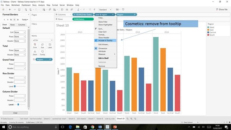
1 Tableau
Tableau is a BI tool capable of creating interactive and sharable dashboards. This software routinely turns up when talking about top data visualization software due to it’s flexibility as an option for both small and large businesses. At it’s most basic level, Tableau can be learned and operated by users of Excel, but can also provide some of the most complex analytics for large corporations.
Price: Their Public version is free. Paid options start as low as $12/user/month.
2 Domo
Domo provides data visualizations depending on your role in the company or the specific industry you work in. Domo’s Card Builder functionality provides a drag and drop interface that lets employees of all backgrounds create powerful data visualizations and clearly and easily highlight key takeaways.
Price: Not provided by the developer. A Professional and Enterprise plan are available depending on the volume of rows required and any needed compliance.
3 Zoho Analytics
Zoho has its roots as a CRM software but also has powerful accounting, human resources, and business intelligence capabilities. Zoho Analytics is capable of turning your raw data into visuals that let you identify trends, outliers, and insights. It also has an assistant named Zia, which is an AI tool that uses machine learning and natural language processing technologies to help answer questions and make sense of your data.
Price: Starts at $22.50/month for the Basic package, providing access for 2 users, unlimited reports, and 500,000 rows (billed annually; $25/month otherwise)