6 Fundamental Design Elements of Effective Visual Business Intelligence Management
How can successful companies evolve past an over-reliance on gut instincts in favor of analytically based decision making?
It’s a question of enough importance that it’s created one of today’s fastest growing business software markets. Big data and business analytics software revenue is expected to reach more than $187B by 2019–which would represent an increase of more than 50% in revenues versus 2015.
In order for business intelligence software to deliver improved performance, massive and complex data sets first must be made comprehensible to decision-makers. Data visualizations have proven an indispensable strategy to achieve this goal.
Today’s business intelligence software platforms offer an overwhelming array of options for displaying data visually. In fact, the mere mention of BI immediately calls to mind images of pie charts, line graphs, gauges, maps, sparklines, scatter plots, and all manner of visualization options.
But the variety of visualization options represents a challenge in its own right. While business leaders might agree with the observation of a recent article published in the Harvard Business review, that visual communication is the “only way to make sense of the work [managers] do,” the question remains which tactics are best suited to which management tasks.
If one looks deeper than case-by-case decisions about line charts versus bar graphs, certain patterns begin to emerge which point the way to more reliably choosing the tools and visualizations best-suited to individual decision-making jobs.
Regardless of company industry, size, or other differentiating factors, visual BI must provide a handful of core common capabilities:
- Aggregation of large data sets into a comprehensible whole,
- Appropriate emphasis of top KPIs,
- Clear display of data trends over time,
- Support for logical data segmentation to convey the role of parts to the whole,
- Comparisons of actual results to expected or desired standards, and
- Support for combinations of data, text, and images which simplify the consumption of complex information.
Understanding best practices for achieving these objectives is a critical step for any company actively seeking a BI solution to improve its ability to more effectively achieve data-driven decision-making. The six fundamentals of visual BI design covered in this article can help organizations more successfully utilize existing business software, as well as identify the capabilities that should be present in future systems to use data to guide effective decision-making.
6 Fundamental Visual BI Design Elements
1 BI Dashboards
Creating a visual means of enabling rapid consumption of key business data is no simple task.
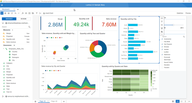
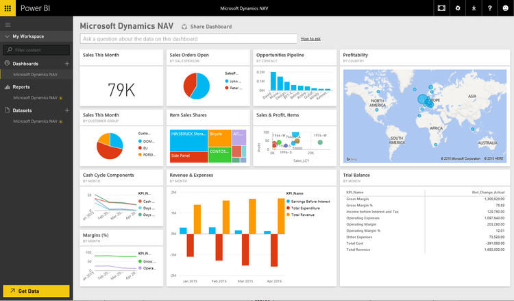
Balancing the right volume of data, while simultaneously presenting it with an emphasis on the most important points, is a tricky design challenge. To meet this goal, modern BI dashboards have evolved to include certain common characteristics.
In general, BI dashboards are usually no larger than what can be viewed on a single monitor screen at a time. Since BI dashboards display a range of business analytics, BI tools must not only provide a variety of presentation formats, but also a workable means for selecting the right position and presentation format for each data point featured in the interface.
The reality is that the BI dashboard represent the beginning rather than the end-point for decision-making analysis. As a result, another critical capability of dashboards is the ability to drill-down into more granular views of aggregated top-line figures.
An effective BI suite will provide significant capabilities for customization. In order to adapt to the unique requirements of individual businesses (and even multiple business functions within the same enterprise), dashboards require configurability that will allow for custom determination of which data elements appear where and in what format.
2 KPIs
Discussing the relationship between key performance indicators (KPIs) and business intelligence dashboards is an exercise in understanding the part in context of the whole. While dashboards form the user interface for accessing business intelligence information, KPIs represent the discrete data points.
But the definition of KPIs can be sharpened up a bit further. Not all business metrics are actually KPIs. For example, a revenue goal is not technically a KPI, because it’s a target rather than a quantifiable measurement of achieved performance.
Subtler distinctions aside, really it’s the inclusion of the modifier “key” that matters most when it comes to qualifying for KPI status. Ultimately, a KPI is a business metric which has been deemed particularly useful in reflecting the achievement of an important business outcome. Because different employees have responsibility for different outcomes, different metrics will qualify for KPI status as a function of the strategic role of the dashboard user within the organization. For example, average days to resolve collection issues would be an unlikely KPI for a CEO with larger strategic business concerns–but would be a very apt KPI for an AR manager. Then again, if the CEO is running a collection agency, perhaps average collection resolution time would be a great KPI for her to monitor!
So context matters when it comes to discussing KPIs. And, the fact is that within the BI dashboard context, certain business metrics are likely to be especially important in relation to others. It’s these KPIs which should be singled out for special treatment.
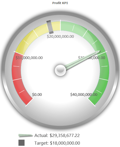
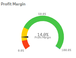
The two presentation styles that are most commonly used to display top KPIs are simple oversized text and progress meters. In order to ensure that top KPIs command the proper amount of attention in relation to their strategic importance, it’s important to be able to not only choose the correct KPI format, but also to ensure placement in a prominent visual position.

3 Historical Trending
Historical trending is about more than simply quantifying what’s working and what isn’t.
Data analysis of historical trends enables a deeper understanding of how changes in strategy, competition, market, and other environmental factors over time affect business results. Pinning quantifiable results to particular time windows is a critical first-step to uncovering and addressing the variables that determine successful business outcomes.
The fundamental challenge of historical data analysis from a design perspective is balancing the ability to quantify individual data points while displaying ongoing trends.
Because of the dominant left-to-right model for consuming written information in English and most other modern languages, the most intuitive formats for visually presenting historical data tend to be horizontal presentations. Careful consideration, must also be paid to the amount of data labeling applied to axes, coordinates, and individual data points.
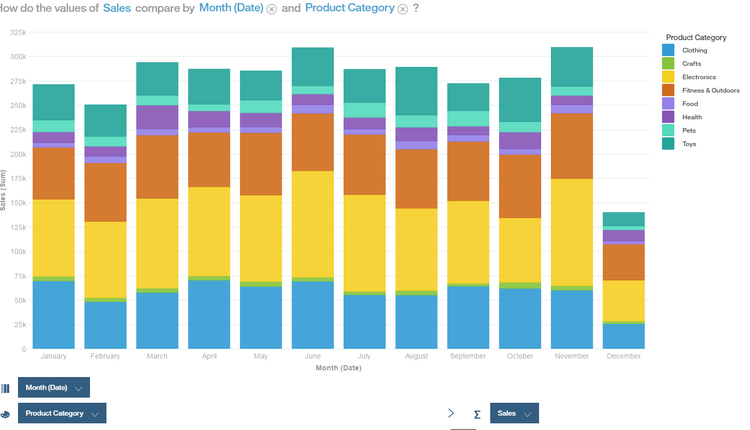

4 Segmentation & Hierarchy
In order for business metrics to be useful, it’s necessary for decision-makers to understand how strategies, resources, personnel, and other conditions in the business environment influence outcomes. For this reason, the ability to segment data is critical to successful business intelligence management.
Multi-dimensional analysis allows for deeper insights into the drivers of top-line results. BI dashboard users rely on the ability to segment data by dimensions such as customer, product/service type, location, department, manager, and sales channel in order to achieve the insights required to improve business decision-making.
The goal of BI dashboards is to make complex data sets more quickly and easily comprehensible. As more data points are added to enable a more granular understanding of contributing factors to business results, this goal becomes more difficult to realize. Good design is key to managing the challenges and ensuring the accessibility of reliable conclusions from BI information.
Standard approaches to the visual display of segmented data involve familiar graphical presentations such as line, bar, pie, and area charts. Because different chart types can be better suited to different data sets, it’s important that effective BI tools offer a range of choices for data visualizations.
One of the most difficult challenges when it comes to communicating segmented data is managing hierarchy. As more levels of hierarchy are added, the difficulty increases. Tree maps and sunbursts charts are among the visualization types that are best suited to displaying multiple tiers of hierarchical relationships and the business results achieved at each level.
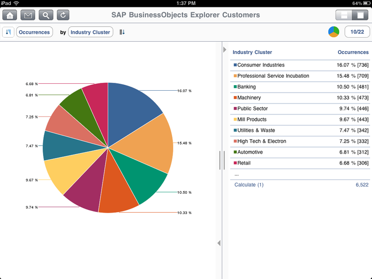
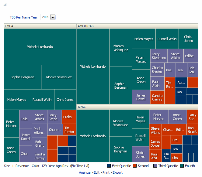
5 Variance and Benchmarking
Defining quantifiable performance standards is a critical step both in aligning the resources necessary to achieve key business objectives and in objectively measuring the success of attaining these goals.
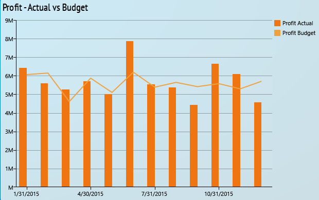
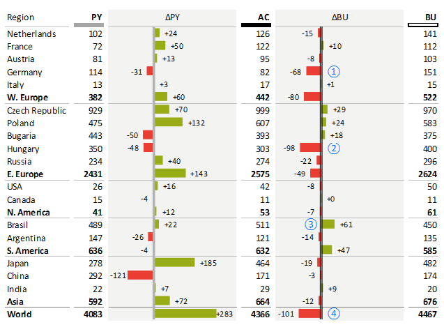
Establishing goals is only part of the equation though. Once goals have been set it’s important to have a mechanism for monitoring progress toward goal achievement. Variance reporting is the analytical task of comparing actual performance against desired results.
As in other important data analysis tasks, successful variance reporting relies on choosing the optimal presentation format for the job. Variance reporting inherently involves the comparison of multiple data series. To complicate matters, variance reporting often needs to compare desired results against actual performance over a time series. The risk with the multiple dimensions included in the typical variance reporting scenario is that the data becomes too dense to be easily consumable.
There are a number of common data presentation formats that are frequently used in variance reporting. For particularly important KPIs, progress meters may be selected. For more complex, multi-series presentations, line charts, bar/column graphs, and data tables are frequently utilized.

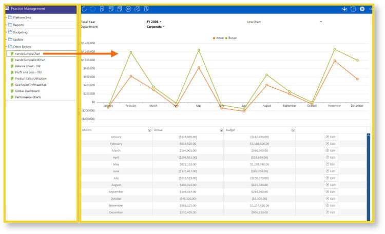
6 Table Graphics
Charts and maps are great. But sometimes a data table can still be a great way to convey a large amount of information in a small space.
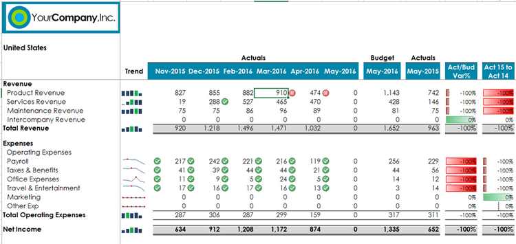
The potential problem with tables though is that the amount of data presented can get overwhelming. A trend in visual BI is to augment standard tables with visual embellishments to direct the viewer experience.
Colors and simple icons can be incorporated into data table presentations in order to achieve two important goals. The addition of a symbol or a color is a great way to draw viewer interest to figures that are particularly important. But not only can colors and icons grab attention–they can also reflect a quality judgement on the figure that is being emphasized. Viewers intuitively understand that red highlights represent negative outcomes, while green ones are positive–for instance.
Because table graphics provide a layer of predefined assessment and direction of attention, they can be especially useful in presentation reports, where it is useful draw viewers to specific conclusions.
One difference between table graphic offered in different solutions is the timing of their application. In some BI tools, presentation oriented editing modes can allow for complete customizability of the application of visual enhancements.
Featured Products
Visualizations from the following BI products were featured in this article: Adaptive Planning, BI360, Datorama, IBM Watson Analytics, Oracle Business Intelligence, Power BI, Qlik Sense, Sage Intelligence, SAP BusinessObjects, SAP Lumira, Zap Business Intelligence, and Zebra BI.
For more information on how to select the right BI program for your business, check out our business intelligence software guide.
